Tuesday 27 December 2011

Experiment of photo mosaic...

experiment with logo...


Experiment of photo mosaic...

here i was playing with fonts...i really like this..i think it looks very interesting...


Eperiment of photo mosaic

to make this photo mosaic, i went on google and downloaded the software...software call shape collage...


this is the screen shot of software that i used to make this photo mosaic...it's very simple...you just upload your photos that you want to use.....you get so many different options like what shape,collage size,space in between,photo size etc..you can also use any font style and the best thing is that you can upload any of you r own design...once you done that you just click on create thats it...


these are just trial...i was just playing with different kind of shapes...


THREE IDEAS

1) get the list of the performers who's  performing on the actual day and get their images....use their images to make photo mosaic of all the performers who's performing...

2) take pictures of something which represents sheffield city and put them together to make photo mosaic...

3) collect photos of people of sheffield and i could do this by talking to people one two one and ask them if i could take their picture and used those picture to make photo mosaic because most of the sheffield people will come to the ALIGHT event...


i think all these three ideas could work...photo mosaic could be used as background while the performers are performing on the stage...i could have one photo mosaic for each ( performers/people/place )

or

i could put all the images and use them to make one photo mosaic...

Thursday 8 December 2011

New Idea....


Photo Mosaic

here i have found something that i really liked...it's call photo mosaic...i really like the fact that how hundreds of different images can make one beautiful image...i think that is really interesting..

this is just an example of photo mosaic..in this video you will see how this thing works...you can actually make this by using softwares...it's very simple....


this is another example that i really liked...in this video you can clearly see how each images works very well...different coloured images has to be at the right places and then only the main image will look real...it has got so much detail....


this is the third example that i have found....and this is my favourite one because of the effect that has been used...how it goes threw so many different images...i think it's very interesting...

Thursday 1 December 2011

logo experiment....


because i am focusing on branding, i thought it would be nice to make leaflet, flier, poster etc...
today i have made three different design and we can use this as a leaflet or flier or poster may be...
at the moment i don't have the information, so i don't know what to write on it..but this is just a sample..

again, i have focused on the three main colours..


i made this design in Photoshop...i have used coloring background and then i used eraser tool...its very simple technique...i think it looks very beautiful...i think i could improve this design by using different shapes...


here is another design that i had did...i used the same technique...i am just experimenting with different shapes..i think all the shapes that i used, they link with the event title witch is ALIGHT...i really like how the sharp patterns are fading out...colour combination worked really well again...


Wednesday 30 November 2011

experiment....

here i have done some experiment with the logo that i made...
i have used after effect for this...i thought it would be nice to make some sort of short animation...
this isn't the final animation, just an experiment but i think i could take this to the next level..


Monday 28 November 2011

colour selection...


so, now i have got my complete logo, the way i wanted...my next task was to select the colour for this logo...
i didn't have to think too much about the colour selection because as i have said before that i made this logo focusing on three different times of the day, so i thought why not use those three main colours which represent the three different times of the day...

so i decided to use these three colours for my logo..

BLUE - represents morning/day time
RED - represents afternoon/evening time
BLACK - represents night time


here i have done some experiment with the colours that i decided to use for this logo...i just wanted to see how it would actually look with the colours...
i thinks it looks really nice but the only problem is the gradient effects that i have used..mainly in the day alight logo...i think the colours are not blending well...i should use less gradient for the day alight logo...

other than that twilight alight and alight into the night looks really good..i am going to do some more experiment with it and try to make them look more interesting...


ideas for logo...

as i have mentioned before that i will be focusing on branding, so i have tried to make a logo for this ALIGHT event...

event's title starts from "A", that is why i wanted to make a logo focusing on letter A...


while i was making a logo, i found this three font style which gave me some sort of inspiration....i really like the shape of the font...i did not want to use the fonts which is already exist so i decided to make a new font...and here is the final outcome of the letter A...

i really like the final outcome...at this point i felt there is something missing so decided to work on it....


while i was thinking of new ideas there is this idea came into my mind..i thought about focusing on three actual event and how can i merge the logo and actual event together...so i why not work on the three different times of a day..

morning
afternoon/evening
night

so, i made this three lined logo which would blend with the letter A...


here you can see how it looks together...the whole logo tell you about the event..i decided to joined the last curved line with the letter A...just to makes it look more interesting...


my next tast was to adjust the text in the logo...as you can see here, i have used three different ways to adjust the text...

from all these three i think the first one is my favourite...i think the first one looks more complete than the others..

Wednesday 23 November 2011

useful website....


http://www.underconsideration.com/brandnew/


this is a very useful website...tells you so much about branding....i really like the way all the logos has been designed..i especially like the BTI logo...it's very simple yet very interesting...colour combination is amazing..also the folded paper effects makes if look even more interesting..


Friday 18 November 2011

Design Outcomes suggested/requested by the client..


Brand: the central visual identity for Alight, to be used across all items/media


Print: flyers, posters, a brochure of events, a premium-quality 'souvenir programme'.


Projection: specifically for the 'Twilight' event at the City Hall - to be used in the venue, to accompany the experience of the musical performances themselves. Can be still-image sequences or moving, but should not be synchronised to performances.


Artefact: a one-off thing that is used to visually link the day's events, as a focus of connection and to give press/photo opportunities, the artefact will be taken to all the key events in the city, in the manner of a baton being passed. The artefact should be light and handleable - not too big, not too small..


Street-art: potential for a single-site piece of work, which could become an event in itself, to support the Alight theme.


I think I will be concentrating on Branding...


  UNITE .
ARISE 
ALIGHT 


these are the three key words for this project...I will be doing my research focusing on these three words...

ALIGHT...

ALIGHT

ALIGHT, based in Sheffield, is one of the 15 major music projects created for this national event, and is being led by the Sheffield Philharmonic chorus;  there will be a substantial list of performers, venues and events taking place in Sheffield and surrounding areas. This will be a major cultural event that also require the creative input of designers and visual communicators from the Graphics course in delivering a number of specific outcomes...


the ALIGHT project will take place over 3 segments of Saturday 03 March 2012

ALIGHT DAYLIGHT (11am-5.30pm) : various events in venues including The Winter Gardens, The Hubs, The Town Hall, The Victoria Hall and Weston Park Museum. Most events will be free...

ALIGHT TWILIGHT (7.30pm-9.30pm) : A fully directed show at The City Hall featuring over 500 local performers. A paying, Ticketed event...

ALIGHT INTO THE NIGHT (9.30pm onwards) : held at The Hubs, music into the early hours. There are a number of desired design outcomes requested/suggested by the client, that are intended to promote, inform and accompany the musical events themselves. These include print items, a promotional campaign, projections for the Twilight event, an " Alight artefact" and potentially some street art work...


Tuesday 8 November 2011

final animation....

Making of Final Animation....

i just realized that i have not been using the font style that i am suppose to be using it for this animation, so the first thing i had to do was to sort out the font style....so, i opened the document in illustrator and then fixed the fonts style...so that i can use it straight in after effects...

1
here is the screen shot of working in illustrator


2
for some reason i couldn't fixed the font style so i decided to do that in Photoshop...i wanted each letter on different layer so when i use them in after effects it would make it more easy to work on...so i screen shot each letter and then saved them on to the different layer as a jpeg file....this time i erased the white background so that i can only get the only shape of the letter and nothing else...


3
at this point i had the actual letter on each separate layer....my next step was to work in after effects...so i went on after effects and started making my final animation...
4
during the experiments of after effects one particular colour contrasts i really liked was black, white and grey...so for my final animation i have decided to use the same colour contrasts....so i made 1 solid layer and used white colour for the background....
5
i then made another solid background to make the particle...i went on effects and gave cc particle effects to this background to make the particle...i chose black and grey colour for that so it stands out on white background....

6
here you can see how the particle looks on the white background...it zoom in when you play the video you will see the effect...i wanted to give 3D effect to it...

7
after setting the particle i then had to set the word ARTS...so, i stated with letter A....i use similar effect for the font because i wanted my animation to blends with the particle.....

8
this is how it looks when the letter A zoom in...slowly it covers the whole screen...

9
i wanted to blends the letters rather than coming induvidually...so i set the letter R when the letter A kind of fade out....i changed the opacity of letter A so that you can clearly see the letter R...
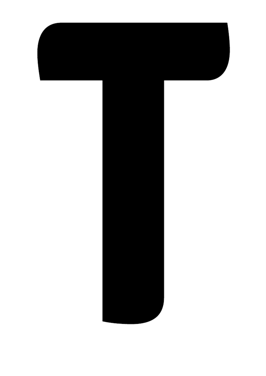
10
i used the same technique for the letter T....

11
again, same technique and effects i have used for the letter S...the only difference is that i changed the position of the letter so that it looks like the letters are coming from all the different direction....

12
after all the individual letters finishes, i wanted them to come all together...this is how it looks like...again, i have used the zooming effect so that it looks like the word ARTS actually coming from the inside...

13
as you can see the letter A has a very nice shadow effect...i wanted to give more depth to the word ARTS so it stands out...I used shadow effect to do that...

14
at the end when the whole word ARTS appears, i used lance flame effect just to makes it look even more better...and i think it worked really well..perfect timing as well....

15

this is the final animation....i am very pleased with my final outcome...it turned out how i wanted to be..simple yet interesting...
the most beautiful thing about this animation is perfect timing of letters and lance flame...which is the key point i think...i believe the timing has to be perfect when you are doing the animation....


making decision toward final outcome...

so at this point i have decided what my final animation is going to be...it will be done in after effects...it will definitely be typographical animation which i have enjoyed very much through out the whole module..it will be simple yet effective at the same time...
i have also choose the music as well which is oil on water...when i heard this music for the first time i decided to use it for my final animation because it's very simple,calm and relaxing...exactly what i wanted...

before starting to make my final animation i decided to do some more sample which would actully help me to get more understanding of after effects....
so, this is what i have done before i started making my final piece....


i really like this short animation....the way how letters changes is really cool...i went on Google and found list of the sky channel and i put them together on one composition and changed the size of channels...i then used espress effects from effect menu which game me this really cool effects....it reminded me of matrix code effect...and lance flame at the end makes it stands out...


this is my another experiment in after effects...this time i played around with shadow.....i think it looks really nice...i think i could use this effect for my final animation......also the colour contrasts of black and silver makes it look even more better...


here i have tried to make 3D animation...it was really fun and challenging doing this...one thing i love about making 3D animation is to play around with camera effects...you can do so much with it...also the particle option is another my favorite effects...i tried to use this effects in most of my animation..


slot machine idea....

more ideas....


Slot Machine Animation
i was browsing on internet and i thought about slot machine...i went on you tube and looked for some slot machine animation...this is one of the example i really liked..i think this is one of the really cool way to play around with words or numbers...so i am going to use this idea for my final animation...


Matrix Raining code...
this is another idea that i really like..as i have mentioned before, i want to focus on typographical animation rather than images, i think this is one of the best example of animation..


this was quick trial that i did today....i am definitely going to explore this idea...i am going to make some more animation in this style....
( i am having difficulties with uploading the video, so i have screen shot the video here )

Monday 7 November 2011

more after effects experiments...


this small animation is another experiment of after effects. this time I have tried to do something different. as you can see the colour contrasts is really nice and I really like how it ends..i used flame effect to do that and i think this effects makes this animation looks even more cool. i think i could improve this by slowing the speed of flame. i think it goes really fast and one more thing which is giving more effects to fonts which would make this look even better....


this is one of my favorite animation that i have done...it's very simple yet interesting. this time i have played with dark background colour and used some particle effects...at this point i am getting more hold on after effects...i am definitely going to make my final outcome which would be something like typographical animation....


here i have tried to make 3D animation...it was totally different experience because it's very different than making 2D animation...you have to use the same techniques but the difference is that you have to set camera for this...it has to be perfect angle otherwise you can mess up your whole animation...it could have been better i think by setting up the camera on right angel and by giving smooth effects to particles....main thing is i really enjoyed making this...

Sunday 6 November 2011

Kinetic typography experiments...


here is an example of kinetic typography...I really enjoyed this session, there was so much to learn...when you look at this animation you thinks it's very simple but to actually make this type of animation takes a lot of effort...we had to match an audio file with the lyrics..this was something new that I have learnt in this session..
i am definitely going to explore this technique and learn more and more about it so that i can improve my skill in this area... 


Tuesday 1 November 2011

old vs new


here you see the differences between the two videos..it's a same lyrics but in two different style..the first one is very old style with no effects...i personally think it's boring...there is no excitement when I read this...

when you look at the second video, it's more interesting and eye catching..so many different effects have been used, it automatically gets your attention..it's a fancy way of showing the lyrics..

1

2

typography animation research


Kinetic typography is the technical name for "moving text". it is an animation technique mixing motion and text to express ideas using video animation..

you have to be careful about what fonts style you are using and how you set them up..I think the most important thing is what effects you use because even if you miss 1 second the whole animation would get messed up...it has to be perfect timing...


Amazing! must have took him so long to make this..I really like how the different coloured fonts has been used..it makes it look even more interesting..and the whole animation stands out because of the  background colour...


in this animation there is not many effects but still simply effective..you can make your animation looks very interesting even without using many effects...


so many different fonts have been used in this animation which makes it look not as effective as the first two animation...you really have to be careful what font style you are using and also what effects you use..