Saturday 12 March 2011

Final Piece - Task 2


Ideas for the Poster Design...

*****
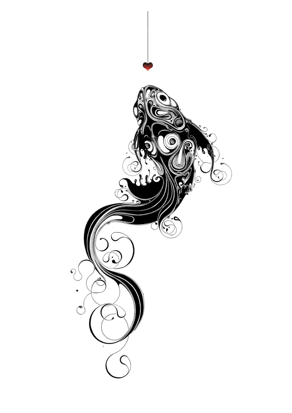
Si Scott is a full time artist / designer who is based in the UK...


His unique style of award winning work – is a blend of hand crafted and hand drawn artwork that has gained him a large and prestigious client list. Si prides himself on an almost obsessive attention to detail and creating the highest calibre of work possible for the studio’s clients, exhibitions and projects.


Si regularly exhibits and lectures around the world, places such as Tokyo, Sydney, Toronto, Norway and New York amongst others. He has also judged many award competitions including the D&AD awards.
Si is part owner of Paper Scissor Stone Store..Si is a visiting lecturer at the University of Huddersfield on the 3rd year BA Hons degree in Graphic Design & Illustration


I love the way he works.


Si Scott

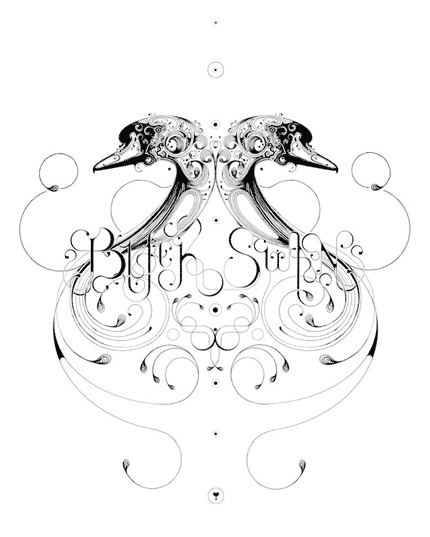
His work with typography is extraordinarily detailed and his treatment of animal portraits is also fantastic.


Si Scott

 His hand drawn illustrations are just beautiful...


G by Si Scott..

*****

*****
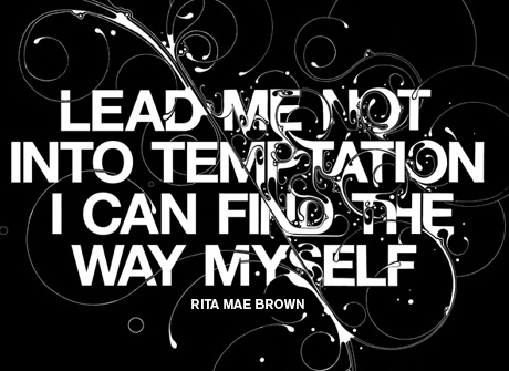
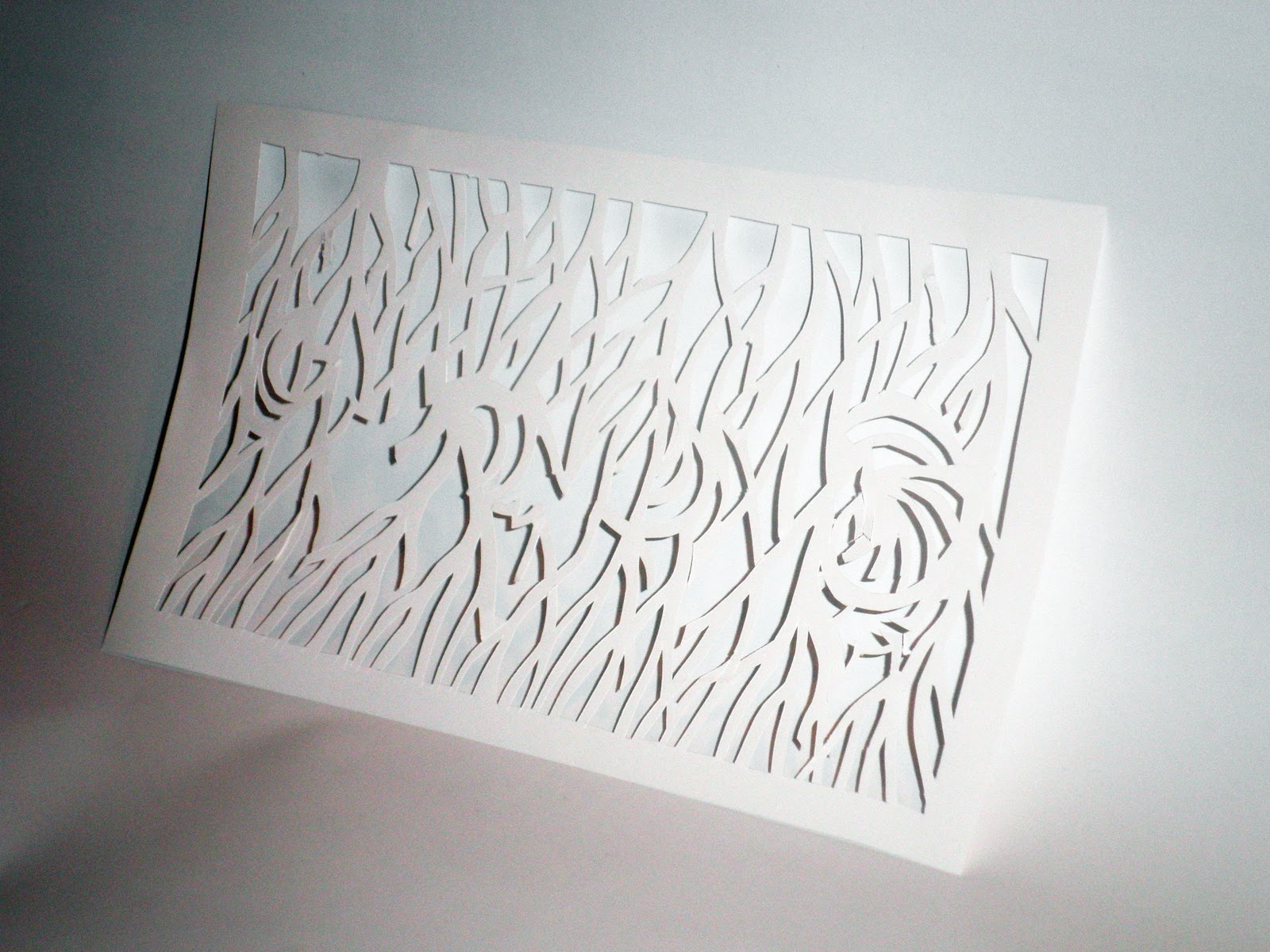
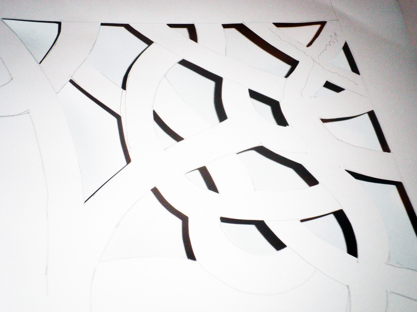
I really wanted to do something like Si Scott's work but the difficulty was to cut the patterns...it's actually easy to draw the patterns but when it comes to use blades that's when it gets really hard...so I then thoughts why not try doing something without including patterns...


This is just an ideas came in my mind...I used photoshop to make this poster and it looks really good..I wasn't 100% satisfied with this poster so I made another poster the one below...


I really like the way I have used the fonts here....it looks so much better than the first poster that I made...I really like how I split the whole poster in different section...

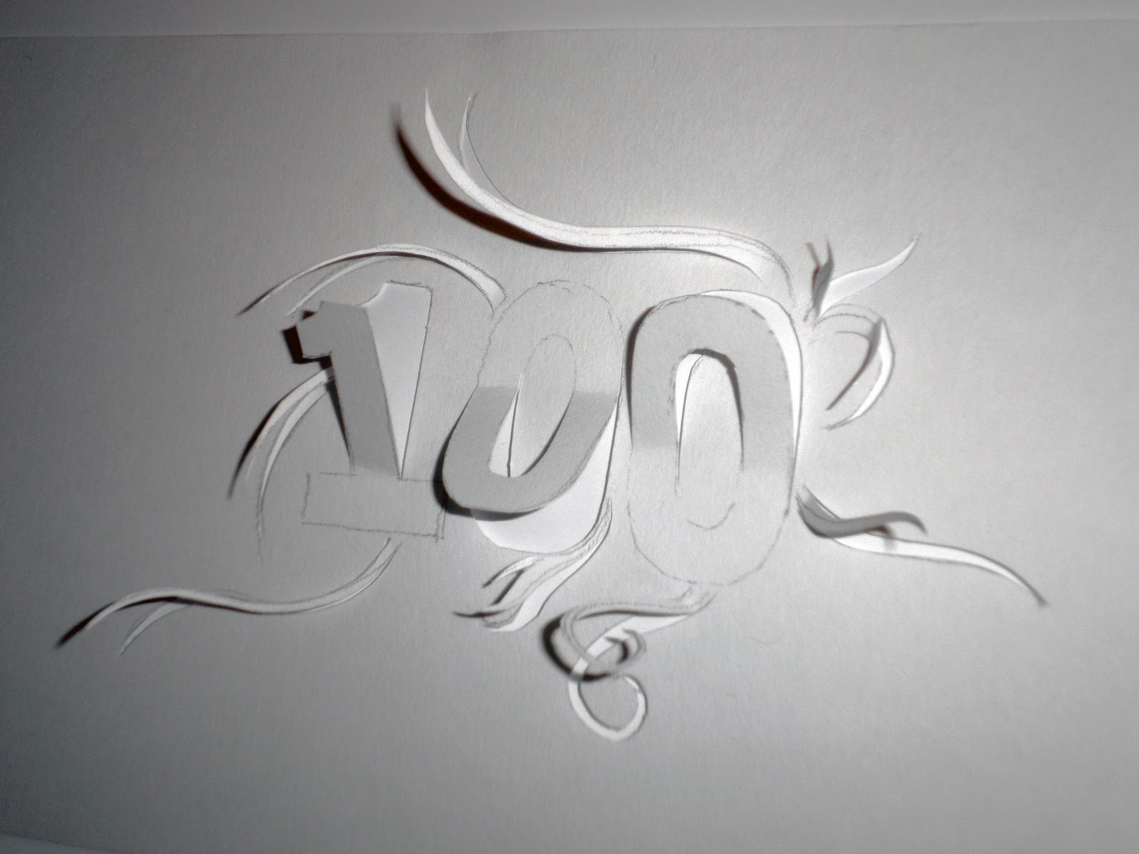
This is the actual cut out of my final poster...


After scanning the poster I then thought I should work more on it..At the moment it was look bit boring so I went on photoshop and applied some effects which gave me totally different look...I think photoshop effect worked really well...it changed the whole mood of the poster...

*****


*****
Final Piece - Task 2

" FINAL POSTER DESIGN "

This is my final poster design for GF Smith Paper and I am very pleased with it...I really like the colour combination of black.white and grey...As I have said before that I wanted to do something in Si Scott's style that is the reason why I chose these three colours for my final poster...

if you look at the poster carefully you will see that the white outline has worked really well and it gives the words sort of 3D effect...

I really like the black/grey rough background...

*****

Final Piece - Task 1

final Piece

After learning diffrent techniques in Richard Sweeny's workshop, I have then finally deciced how I want my final piece to be..If you look at my work you will see that I have used curve shape in most of my work and they worked out really well so I have decided to consontrate on that technique and I applied that to make my final piece...


*****


this is my final outcome for the task 1...I really like this and I am pleased with it..It looks very simple and that the good thing about it...I was allowed to use cello tape and glue but I wanted to do my final piece without using any tape or glue...I learnt this locking techniques in Richard's first workshop and I really it and that is the reason why I used that technique here...Plus it was more challenging to actually do this without using tape or glue....


Here you can see the inside part of my final outcome..


This image reminds me of some sort of animal horn...


You can see clean cut of paper edge...


I overlapped the paper and it worked really well... 


*****

Friday 4 March 2011

Task - 2 POSTER DESIGN


Poster Design experiments....

For my tast - 2     I have to create a poster and it should include 

 100 YEARS OF GF SMITH PAPER
DESIGN MUSEUM 
01 - 31 JULY 2011

" logo of GF SMITH PAPER"
*****


*****
Below I have done some experiments to make my poster..I have used Peter Callesen's technique here but I found it hard to create the actual shape of the design...This time I only did 100 because I wanted to see how it would look...I think I will do more of these..


                                                   *****


                                                                            *****
Here is my second experiment that I did but this time I have used Chris Natrop's working style..I drew the design on a piece of paper and then I used tracing paper to get the correct shape...After that I started cutting my design..I am very pleased with what I have done here because it looks really nice especially with the green background...I have also tried to take picture of my work in Chris's style and it worked out really well...I love the shadow effect here... 


                                                                         *****


                                                                         *****


*****


*****


I really like the way I have done this..I tried to merge the patterns with the information that I have to put in to the final poster and I actually got this ideas from my research...I have tried to use that patterns to my final poster...Its hard to see number 100 and that's what I like the most..With the dark background it stands out really well..


Complete poster image..I have used dark background just to see how it would look and you can see it stands out really well...As you can see the image below which has similar patterns in it.


picture that I took in town for my research..
*****