Poster Design experiments....
For my tast - 2 I have to create a poster and it should include
100 YEARS OF GF SMITH PAPER
DESIGN MUSEUM
01 - 31 JULY 2011

" logo of GF SMITH PAPER"
*****
*****
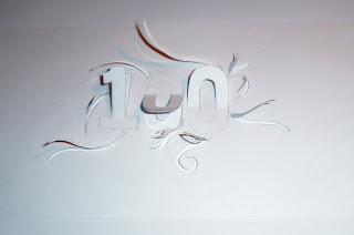
Below I have done some experiments to make my poster..I have used Peter Callesen's technique here but I found it hard to create the actual shape of the design...This time I only did 100 because I wanted to see how it would look...I think I will do more of these..
*****
*****
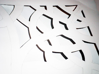
Here is my second experiment that I did but this time I have used Chris Natrop's working style..I drew the design on a piece of paper and then I used tracing paper to get the correct shape...After that I started cutting my design..I am very pleased with what I have done here because it looks really nice especially with the green background...I have also tried to take picture of my work in Chris's style and it worked out really well...I love the shadow effect here...
*****
*****
*****
*****
I really like the way I have done this..I tried to merge the patterns with the information that I have to put in to the final poster and I actually got this ideas from my research...I have tried to use that patterns to my final poster...Its hard to see number 100 and that's what I like the most..With the dark background it stands out really well..
Complete poster image..I have used dark background just to see how it would look and you can see it stands out really well...As you can see the image below which has similar patterns in it.
picture that I took in town for my research..
*****


No comments:
Post a Comment